Header
Every element in the storefront header, and the switch that turns each one off.
Admin → Header
Nine elements, one switch each. They all ship on, so an untouched install shows the full header.
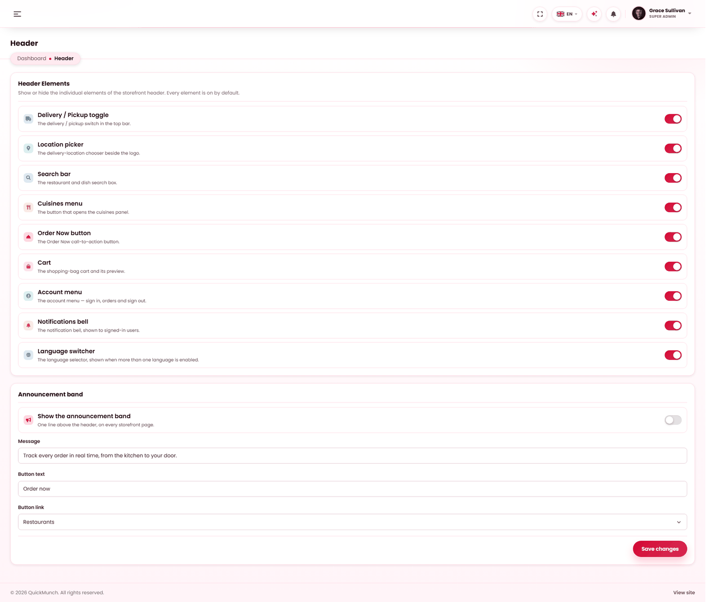
Nine elements, one switch each. Every one ships on, so an untouched install has the full header and switching one off simply stops it rendering.
| Element | Switch it off when |
|---|---|
| Delivery / Pickup toggle | You only do one of them. Offering a choice with one option looks broken. |
| Location picker | You serve one area, or you do not use location at all. |
| Search | You have few enough restaurants that browsing beats searching. |
| Cuisines menu | Your cuisine list is thin — see Classifications. |
| Order Now | Your homepage already leads with ordering. |
| Cart | Rarely. Only makes sense on a browse-only site. |
| Account | Rarely, and never if customers have accounts — it is how they reach their orders. |
| Notifications | You would rather not draw attention to an empty bell early on. |
| Language | You publish in one language — see Languages. |
The Pages mega-menu is not on this screen. Its switch lives on the Navigation screen beside the menu it opens, so the whole decision stays in one place.
The announcement band
A strip across the very top for a notice — a launch, a closure, a promotion. Unlike the nine elements it ships off, deliberately: an update should never grow a bar across the top of a storefront that is already trading.
Its switch and its words are saved together because they are one decision. The words are content, so they are written per language, and the link accepts a web address, a mail address or a telephone number — anything else is refused rather than published.
Sub-header
The band that sits above the content on a page or a blog post — the one carrying the title and breadcrumbs. Two independent decisions.
Which style each content type uses
| Content type | Ships as | Options |
|---|---|---|
| Pages | Classic | Classic, Modern, Hidden |
| Blog posts | Modern | Classic, Modern, Hidden |
They are set separately, so posts can carry a photographic band while pages stay plain. Hidden removes the band entirely and the content starts at the top.
Per-style options
Classic and Modern each have their own settings, so changing one never disturbs the other:
- Breadcrumbs — show the trail back up.
- Description — show the page's own description under its title.
- Background — none, an image, or an MP4 video. The image and the video are stored independently: setting one never clears the other, and the type dropdown decides which is live. So you can trial a video and drop back to the image without re-uploading it.